The cappuccino savings plan
And the remarkable story of compound returns

Hey, have you heard about my cappuccino savings idea?
No, well how would you like to, build a fund of £50,000 (or more) for the price of a coffee each day?
Well, the chances are that you can.
Take a look at this incredibly simple chart.
It’s one of the most important charts you’ll ever see in financial planning, because it shows the power of compound investment returns.
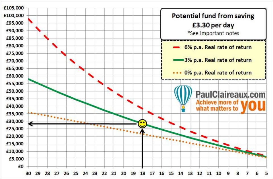 What can you use this chart for?
You can use this chart to estimate the funds you’d build up by saving just £3.30 per day…
…yes, the price of a coffee 🙂
I’ve done the hard work for you here: by showing the funds you could build, with inflation taken into account.
Or, to put that another way, these funds are in today’s money terms – and that’s what you need because you only know about the price of ‘stuff’ today right? 🙂
Now, I’ve assumed that your savings will go into some kind of low cost /tax-free savings vehicle (like an Individual Savings Account: ISA) in the UK.
Most countries have some kind of tax-free savings product, but if you don’t in yours, just ‘tone down’ your return assumptions to take account of tax.
Use the chart for any savings level
You can use this chart to estimate the funds you might build from higher levels of savings too.
All you have to do is scale up the result 🙂
So, for example, if you want to know what savings of £6.60 per day (£200 per month) will give you over the long term … then simply double the results you get from this table.
Simples eh? 🙂
And, if you’re struggling to think about how you can save for the future, take a look here for ideas on that – and then refer back to this simple chart.
Here’s all you need to do
- Choose one of your BIG savings goals: it can be anything at all…
- Then, on the base of the chart, find the number of years you have left, before that goal arrives.
- Notice how the numbers run backwards on the chart – to remind you that the longer you leave things, the less time you’ll have left to save.
- Scroll up to the appropriate* fund line and
- Read across to the left-hand side to get an idea of what £3.30 of daily savings could build up to.
That’s it!
Here’s an example:
‘Beau’ wants to build a fund to help her new baby through university in 18 years’ time.
So, she wants to know, roughly, what fund she might build up by saving over that time?
We’ll assume that she will follow our ‘cappuccino’ savings plan and that she enjoys moderate investment growth on her funds over the period.
To find out what funds she might build up – just follow the smiley face, on the chart.
You’ll see that she could potentially build a fund of c. £30,000 (in today’s money terms) towards her goal – and that would be hugely valuable when the time comes for her baby to head off into some sort of higher education.
Your turn now
Have a play with the chart, to see what funds you might build up, simply by saving for your long term goals.
The BIG messages from this chart
Sorry if these messages seem simple and obvious, but they’re worth stating anyway.
After all, most people don’t save for the long term. So, it must be worth sharing these ideas right?
And the simple truths are these:
- If you start saving for your longer-term goals, years before they arrive, your likely outcomes are good.
- If you wait until those goals are nearly upon you, your likely outcomes will be very painful.
What else do you need to know?
Well, obviously, there are some limitations to this chart.
So, if you want to explore the cost of funding your income in retirement – using a pension, you’ll need to add a few more steps to this process… and if you have any existing funds set aside for your goals, you’ll need to take account of those in your calculations too.
Of course, a good financial adviser could help you with all this but not everyone can afford to pay for that help. So, you might like to learn how to deal with this stuff yourself, either in a 1-2-1 lesson – or at one of my workshops.
This really is EASY and FUN to learn
You can find out more about my financial life coaching here or you’ll soon be able to learn more about this stuff in an online course that I plan to offer later this year.
And, if you’d like me to keep you posted on that, just sign up to my newsletter at the bottom of this page.
Here’s the detail behind that chart
The numbers on this Cappuccino chart assume personal contributions starting at £100 per month (c.£3.30 per day) and rising each year in line with inflation.
By showing funds in today’s money terms, I’ve taken account of inflation between now and the end of your savings term.
Why is there such a wide range of outcomes?
For simplicity, there are just three lines on the chart.
They show a wide range of outcomes because I’ve used a reasonably wide range of assumptions about ‘real’ investment returns.
As you can see, different investment returns have a huge impact on our savings over the long term when compared to shorter-term saving.
Obviously, there are many more possible outcomes than those shown by the lines on this chart.
Your outcome could fall somewhere in between these lines or outside them altogether if the growth on your fund is much higher, or lower, than the ranges we’re using here.
Real rates of return (RROR) is just shorthand for returns above inflation.
The assumptions for the three lines shown are:
1. The top (red, dashed) line uses a high (6% p.a.) RROR after charges.
2. The middle (green, solid) line assumes a moderate (3% p.a.) RROR after charges and
3. The bottom (orange, dotted) line assumes zero RROR after charges.
*Which line should you use?
Ha! Well, that’s the $64 million question…
With longer-term saving of, say, 15 or more years to run to your savings goal, and depending on your overall financial situation, you might be happy to estimate your potential funds by taking a point between the top red line and the middle green line.
For these longer savings terms – and where monies are invested regularly and wholly into higher return/higher risk (stock market-based) funds, there is a reasonable chance (though no guarantees!) of obtaining real investment returns of between 3% and 6% p.a.
This assumes that the charges on your savings plan are very low of course – and you’ll need to keep an eye on that… because, sadly, some financial product suppliers charge too much!

For shorter-term savers, a more conservative assumption may be appropriate.
It all comes down to your attitude and ‘capacity for investment risk’ – a factor of many things – which we’ll come back to another time.
How have stock markets performed in the past?
Well, you need to remember the warnings that should be clearly shown on all investment products:
Past performance is no guide to future returns.
The value of investments, and the income from them, can go down as well as up.
You could get back less than you invested.
All investments should be regarded with a long-term view.
For what it’s worth, the UK stock market produced total ‘real’ investment returns (including reinvested income) of about 5.5% p.a. on average over the past 50 years.
However, this figure masks some huge variations:
In some decades we’ve enjoyed real returns of nearly 13% p.a. …
Whilst in others (as from the end of 1999) we’ve seen negative real returns.
[Source: Barclays/Equity Gilt study]
It’s also essential to understand this.
The actual returns you enjoy if you regularly invest into stock market type funds… are likely to be different (and could be higher or lower) to the average returns on those funds over time.
Say that again!
Ah, yes!
I’m sorry, I thought that might throw you.
And yes, it does sound completely mad 😉
The thing is… returns from regular savings are dependent on the ‘path’ that fund prices take, up to the point at which we take our money out.
This curious effect is sometimes called pound (dollar) cost averaging – and we’ll explore it in detail in a future Insight.
For now – just be aware that this curious effect can be your friend – if you’re saving regularly over the long term.
But it can also be an enemy to those who are taking money out of an investment-linked fund – in retirement for example.
So, it’s worth learning about.
Just be reasonable
The KEY point to remember here is that any assumptions you make about investment returns need to be ‘reasonable’ with regard to the potential performance of the assets (or funds) you hold inside your savings plan.
So, you must accept that with greater ‘potential’ returns there’s often a greater risk of price falls.
It also means that if you choose to save into simple cash deposits at the bank or building society, you’re unlikely to enjoy high (or perhaps any) ‘real’ returns (above inflation) over the medium to long term
That said, there are some savings products, like the new ‘Help to buy’ ISA and Lifetime ISA which offer a ‘FREEBIE’ bonus from the government.
And these make cash deposit type saving very worthwhile indeed for those who are eligible for these products.
Keep an eye on charges
Finally, the assumption you use for your prospective investment returns needs to take account of the drag from all the charges on your savings product.
There could be charges on the product wrapper, charges on the funds within it, and more charges for advice.
The level of these charges varies enormously between product providers and advisers.
So please be sure to take account of all charges being taken from your plan.
And take good care out there
Paul
For more ideas around money and personal performance, in an occasional newsletter, sign up here.
And, as a thank you, I’ll send you my ‘5 Steps for planning your Financial Freedom’ …
…and the first chapter of my book, ‘Who misleads you about money?’ Or, if you’d like more frequent ideas (and more interaction) …join my facebook group here

And feel free to share your thoughts in the comments below.
You can comment as a guest (just tick that box) or log in with your social media or DISQUS account.
Discuss this article